
Content Authoring
Basic Content Creation
Learn how to use ClearXP's authoring tool to create custom learning content with components, quizzes and multi-screen navigation.
ClearXP comes with a built-in authoring tool for creating your own learning content. The editor’s capabilities allow the creation of multi-screen activities consisting of static content, quizzes as well as more complex interactions.
Creating a New CMS Activity
Section titled “Creating a New CMS Activity”1. Start by creating a new CMS Page activity as described in Adding Activities
2. On the New Activity screen, give the Activity a name and click Save Changes
3. Scroll down to the Content section – the Content Type will have been pre-selected as CMS Page but you now need to select a Layout Template from the list available:
Blank Template
Section titled “Blank Template”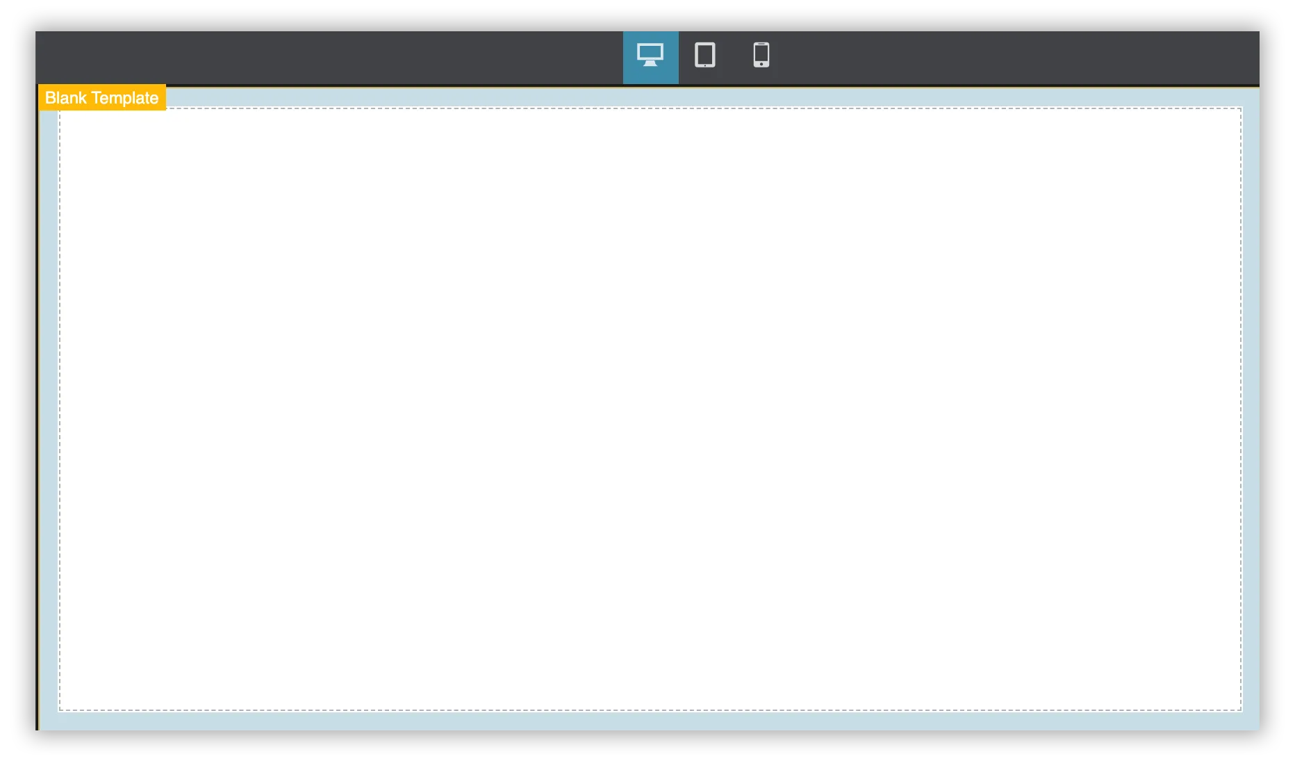
A bare-bones template that allows the creation of vertically scrolling content. Multiple screens can be linked together manually to build decision-tree navigation.
Full Screen Template
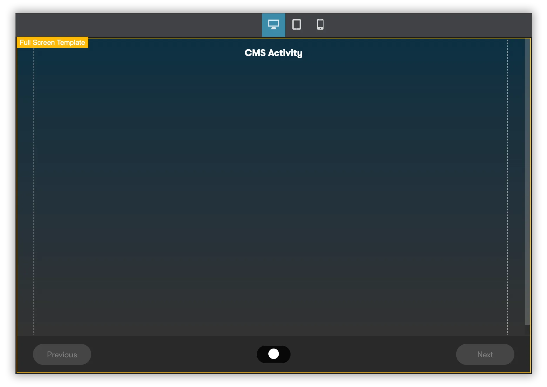
Content is centered vertically on the page with a linear navigation bar at the bottom of the screen. Useful for creating Powerpoint-Style content with navigation always moving to the next slide.
4. Click Save and Edit Content to save your template selection and launch the authoring tool.
Using the Authoring Tool
Section titled “Using the Authoring Tool”The ClearXP authoring tool allows the creation of learning content by dragging Components onto the Canvas. Components have editable Properties that can be changed to customise their behaviour. Continue reading to learn how to control this functionality.
Navigating the Interface
Section titled “Navigating the Interface”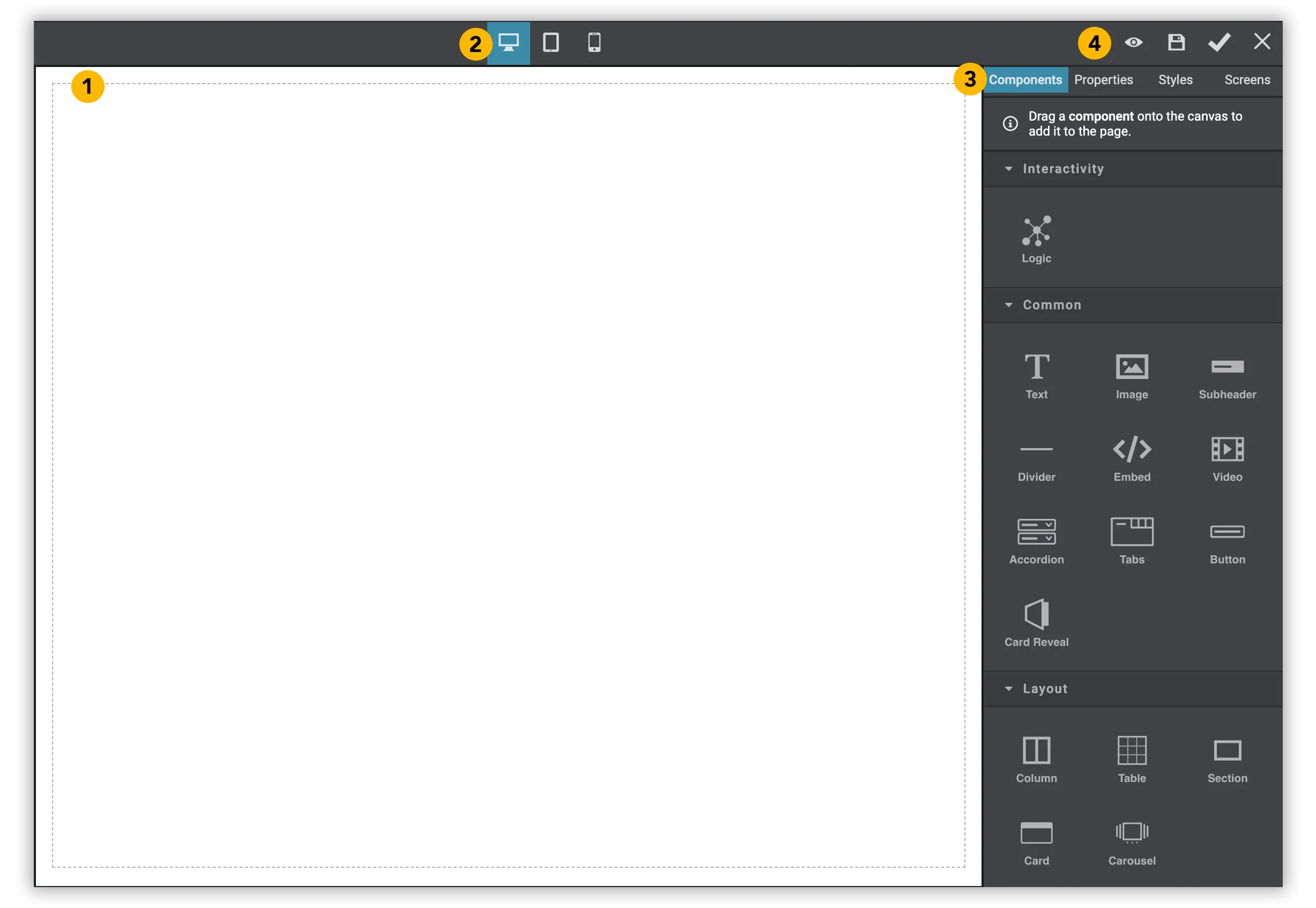
- The Canvas – The area where all components can be dragged and dropped onto to add to the content on the page. Components added to this area can be interacted with by clicking to select and dragging to a new location or editing (see Editing Components below).
- Device Preview – Select either Desktop, Tablet or Mobile to preview how the content will look on different screen sizes.
- Selection Tabs –
- Components: A list of components that can be dragged onto the Canvas to add content (see Adding Components below).
- Properties: Will display any editable properties for the selected component (see Editing/Deleting Components below).
- Styles: Override component styles such as font sizes, colours, etc. (see Changing Component Styles below).
- Screens: Add or manage multiple screens for this content (see Adding New Screens below).
- Editor Controls –
- Preview: View a preview of the content in the editor
- Save: Save any changes to a draft version
- Publish: Save and publish changes for immediate access
- Exit: Close the editor without saving.
Adding Components
Section titled “Adding Components”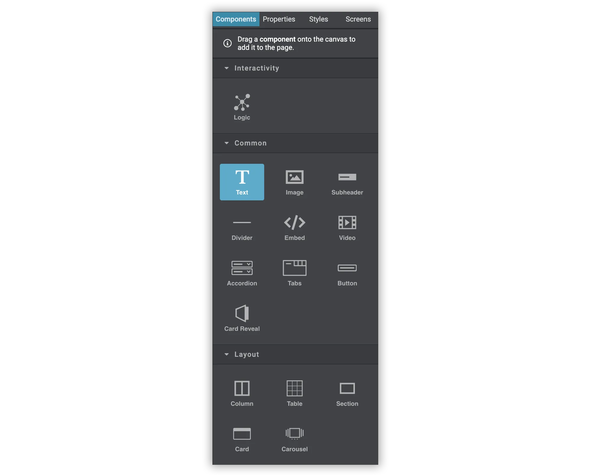
With the Components tab selected, hover over the component you wish to add then click and drag to drag the component onto the Canvas. As you drag, a horizontal line will appear showing where the Component will be placed on the page when you release the mouse.
Editing/Deleting Components
Section titled “Editing/Deleting Components”Once a Component has been added to the canvas, it can be moved around or its properties can be edited to change its behaviour.
Start by clicking on the Component to select it.
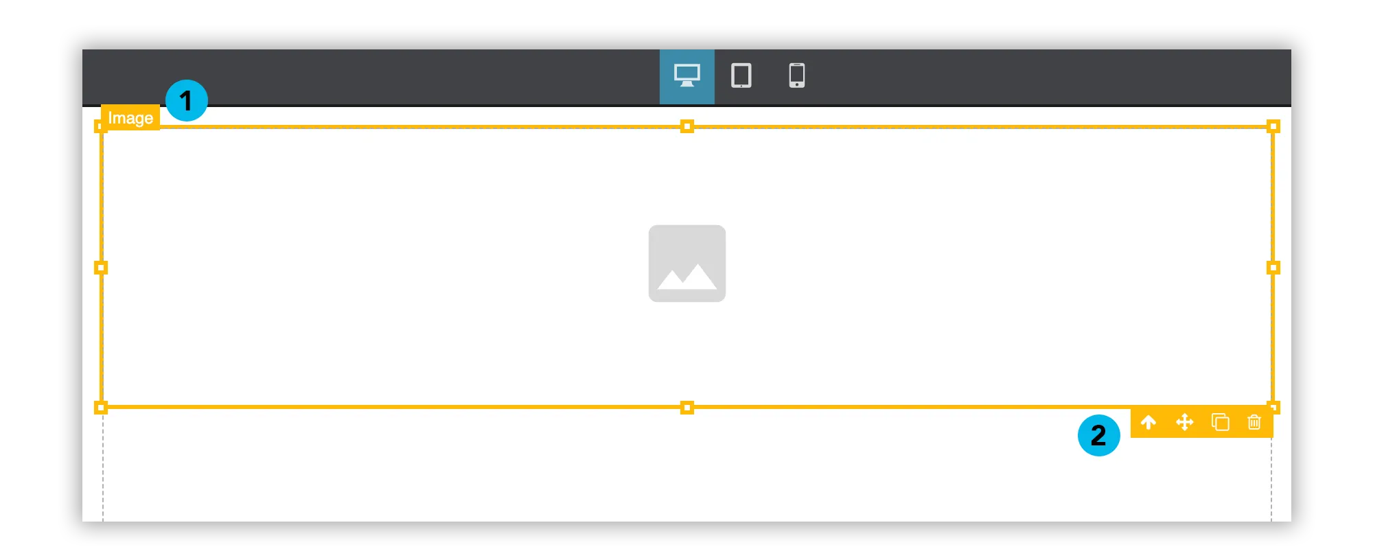
A border will appear around the selected component which displays the following information:
- The name of the selected component
- The component toolbar –
- Up Arrow: Click to select the parent/container component
- Drag Handle: Click and drag to move this component within the canvas
- Clone: Click to duplicate the component
- Trash: Click to delete the component from the canvas
Selecting Properties in the Selection Tabs will reveal a number of component-specific properties that can be changed to alter the behaviour of the component.
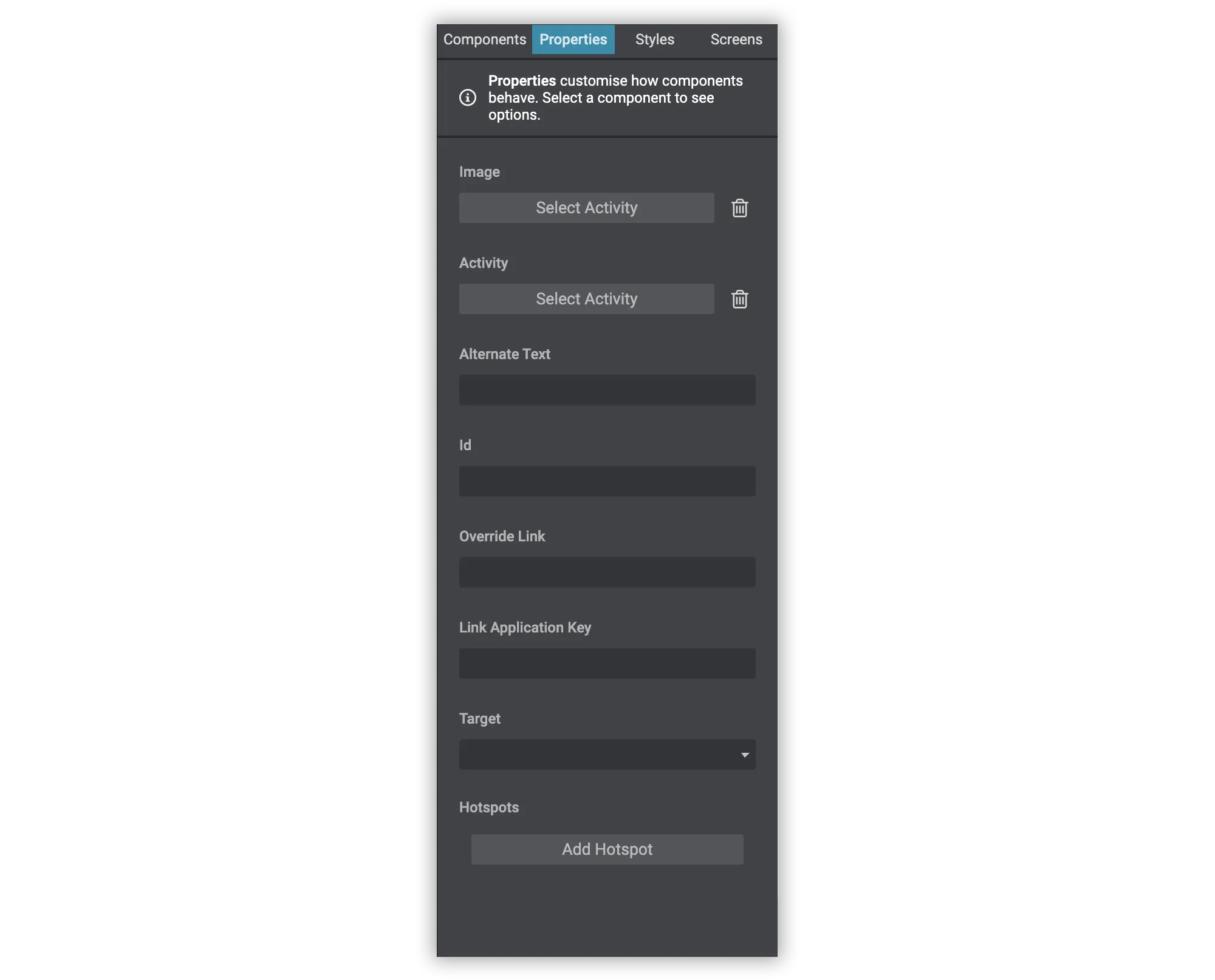
The Properties tab is where non-visual aspects of the component can be set, such as selecting the image for an Image component or setting the options and correct response for a Multiple Choice component. See what properties are available for a given component in the Component Reference section below.
Changing Component Styles
Section titled “Changing Component Styles”With the Component selected, you can also edit many aspects of its visual style by selecting the Styles tab.
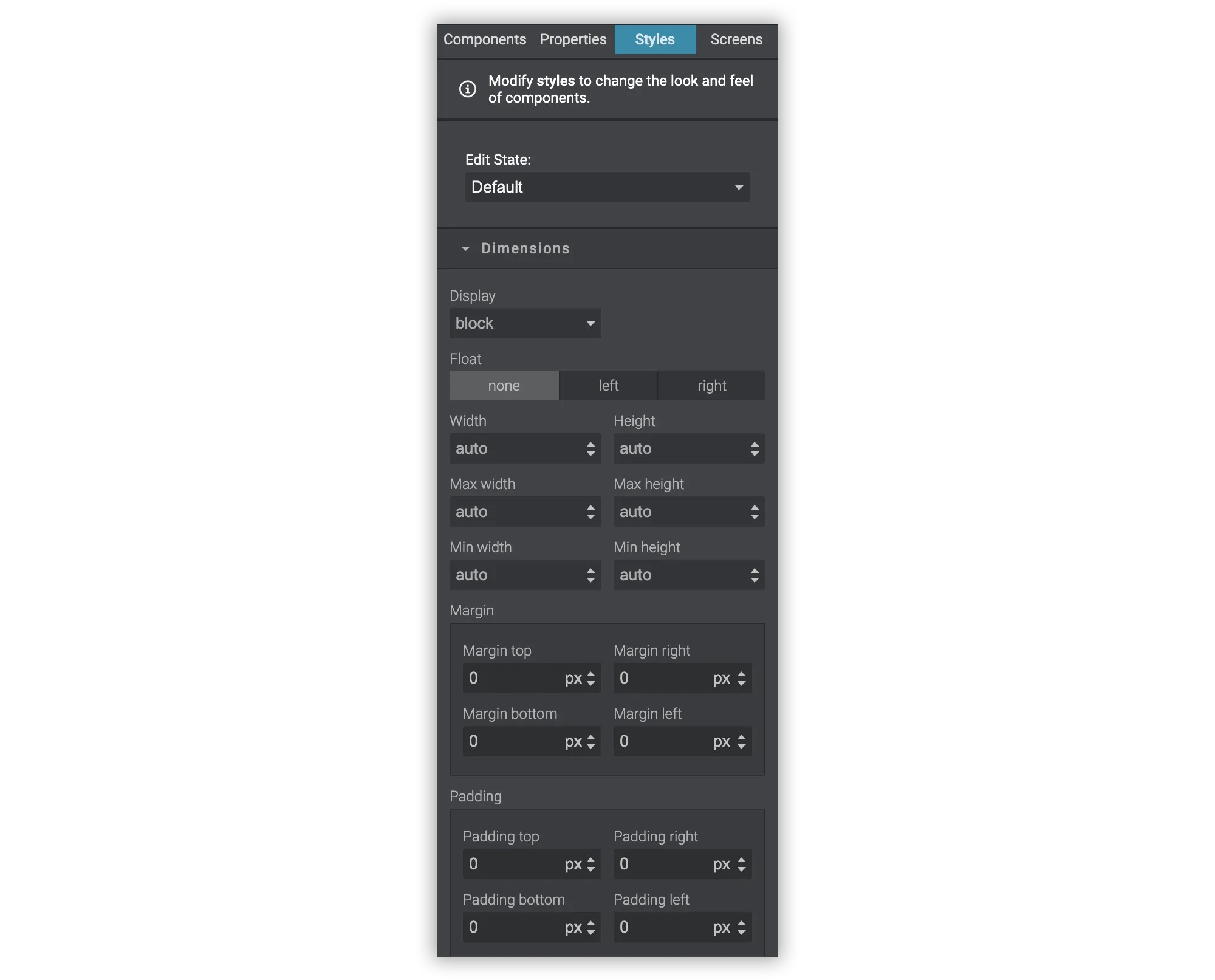
Simply edit each respective field to customise the styles as desired. Styles that have been edited will change to orange but these can be reset by deleting the input field.
Adding New Screens
Section titled “Adding New Screens”Most templates include the ability to navigate between multiple screens. To add or manage existing screens, click the Screens tab.

Click New Screen to create a new screen. You can edit the content on each screen by clicking the screen from the list to load that screen’s content into the Canvas. To delete a screen, click the trash icon below its name.
Component Reference
Section titled “Component Reference”The following is a list of all available components and any configuration options.
Common Components
Section titled “Common Components”| Component | Description | Configuration Options |
|---|---|---|
| Text | Free text for writing formatted content. | |
| Subheader | A block element with text for breaking up the page into sections. | |
| Image | Upload or add an existing image to the page. |
|
| Embed Code | Insert custom HTML code that may be supplied from YouTube, Vimeo, etc. |
Layout Components
Section titled “Layout Components”| Component | Description | Configuration Options |
|---|---|---|
| Columns | Splits the page into two columns so content can be displayed side-by-side. |
Quiz Components
Section titled “Quiz Components”| Component | Description | Configuration Options |
|---|---|---|
| Quiz | A container for quiz input elements, responsible for submitting and grading the quiz. |
|
| Text Input | A free text input field for collecting open-ended responses. |
|
| Multiple Choice | A drop-down selection of multiple responses. |
|
| Rating Scale | Sets and displays the scale for Rating Question components. |
|
| Rating Question | A question for the preceding Scale Rating. Ensure a Scale Rating exists in the content prior to this component, otherwise no options will be displayed. |